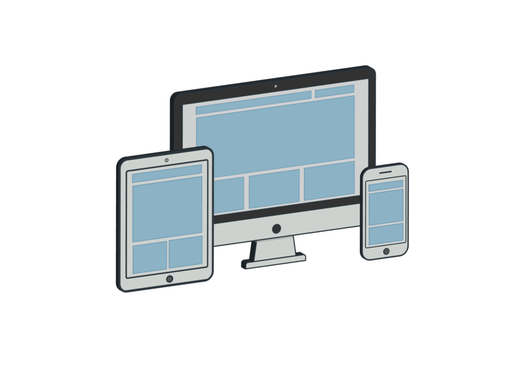
Responsive design used to mean “make it work on mobile.” In 2026, that’s barely the starting point. Between foldables, ultrawide monitors, variable refresh rate panels, HDR displays, and users with color vision deficiencies, the “environments your interface must survive” list is longer than most CSS breakpoint systems account for. And yet most front-end developers still test responsive work the same way they did five years ago: resize the window, tick mobile view in DevTools, maybe run Lighthouse, call it done.
That’s not enough anymore. The modern developer toolchain needs a layer of fast, browser-based checks that answer specific questions — what’s the actual CSS aspect ratio I’m working with? Does this interface survive for a user with deuteranopia? Is my image asset sharp at the user’s pixel density? — without the overhead of installing a new tool, creating an account, or firing up a full framework. This guide walks through the testing domains most frequently neglected in modern responsive work, and points to the lightest-weight way to cover each one.
Why browser-based tools beat installed alternatives
There are three reasons developers gravitate toward browser-based utilities over desktop equivalents. First: zero friction. No installer, no license key, no account prompt before you can see results. Open the link, run the test, close the tab. For a quick debugging loop where you’re burning 30 seconds on each check, that setup overhead compounds fast.
Second: cross-platform reality. The same tool works identically on your Windows dev laptop, your macOS review machine, and your staging iPad. You don’t need three versions of one utility, and you don’t need to remember different keyboard shortcuts per OS. Third — and this is the one most developers underrate — browser-based tools reflect the actual environment where your code runs. The browser is the host. When a test tool executes in the browser, it observes the same rendering pipeline, the same color profile, the same event model that your users experience. A desktop calibration utility reading your monitor through the OS sees something slightly different from what your CSS and JavaScript actually work with.
Screen size and resolution testing
The first gap: developers regularly write media queries without knowing what the target device actually reports. Physical screen diagonal, native resolution, CSS pixels, device pixel ratio, and the browser’s viewport are all different numbers, and only some of them are what your CSS breakpoints key off.
When a media query doesn’t fire the way you expect on a client’s device, 80% of the time the root cause is a mismatch between assumed screen width and browser-reported width. A quick screen size detection tool run in the same browser surfacing the same viewport dimensions, DPR, and orientation values your CSS actually receives removes the guesswork in under 10 seconds. This is particularly useful when debugging breakpoints on devices you don’t own — send a client a link, ask them to open it, screenshot the result. You get the exact numbers their browser is working with, not what the device datasheet says.
Aspect ratios drive modern layout
The CSS aspect-ratio property became broadly supported in 2021 and is now the default tool for video embeds, card grids, hero sections, and anywhere else you need a box that holds its shape across widths. But every time you declare aspect-ratio: 16 / 9 or aspect-ratio: 4 / 3, you’re making assumptions about source content — and source content doesn’t always match. A video provider ships assets in 21:9. A product image gallery pulls in photography at 3:2. Your grid expected 1:1.
When the numbers don’t line up, you either letterbox, crop, or do runtime math. Aspect ratio calculators save the mental overhead: paste the source width and height, read the ratio as a decimal or a simplified fraction, drop it into your CSS. For responsive layouts where you’re juggling several aspect formats across breakpoints (a common pattern: 16:9 on desktop, 4:3 on tablet, 1:1 square on mobile for the same component), having a calculator open in a tab during layout work is faster than repeatedly typing expressions into the browser console.
Pixel density matters more than most developers admit
PPI — pixels per inch — is the metric that decides whether your image assets look sharp or slightly soft on a user’s display. The calculation is straightforward: take the diagonal screen size in inches, take the native resolution, compute pixels per inch using the Pythagorean theorem on width and height in pixels. In practice, almost no developer does this math by hand. Instead, most teams pick target densities (1x, 2x, 3x) from convention and hope for the best.
That works until you hit an edge case. A 27-inch 4K monitor and a 13-inch laptop at the same 4K resolution have radically different PPI values — one is around 163, the other is around 339. If your responsive images via srcset or your SVG rendering was tuned for one and you’re testing on the other, something is going to look wrong and you won’t immediately know why. PPI calculators take the target device’s dimensions and native resolution, return the exact PPI, and let you pick the right image asset tier. Essential for print-adjacent work (ebooks, PDF exports, design systems that include physical-world outputs) and for any dev working with art-directed responsive imagery.
Display characteristics: refresh rate, ghosting, dead pixels
This category is often dismissed as “not a web developer’s problem,” but it is — in three specific situations. The first is animation-heavy interfaces. Your CSS transitions look perfect on a 60Hz laptop panel. On a 144Hz monitor, the same animation either looks buttery smooth or exposes dropped frames you didn’t know existed. Refresh rate tests that let you verify the actual panel refresh in-browser (not what the device reports, but what it’s actually delivering) are a single-click sanity check that saves QA cycles on motion-heavy interfaces.
The second situation: client-delivered devices. If you’re shipping a kiosk build, a tablet app wrapped in a webview, or a touch-screen POS interface, running a dead pixel test and a ghosting test on delivered hardware before sign-off catches bad units early. The third: designers or PMs on your team bringing in new monitors. A two-minute check before they start work on pixel-perfect comps saves hours of “this color looks different on my screen” debates downstream.
Color accessibility is still a blind spot
Roughly 8% of men and 0.5% of women have some form of color vision deficiency. Red-green deuteranopia and protanopia are the most common. Any interface that communicates state through red-vs-green alone — form validation, status indicators, charts, diffs, dashboards — excludes this segment by default. WCAG 2.2 doesn’t just recommend against this pattern; success criterion 1.4.1 explicitly requires that color not be the sole visual means of conveying information.
Automated tools like axe-core and Lighthouse catch the worst offenders in contrast ratio audits, but they’re not the full picture. A color blind simulator that lets you view your interface through deuteranopia, protanopia, tritanopia, and monochromacy filters is the fastest way to catch issues the automated tools miss. Particularly valuable for data visualization work (color palettes in charts rarely survive deuteranopia unmodified), for status systems, and for form validation UX. Run the simulator, screenshot the result, use it in code review when palette decisions come up. A 90-second check that most teams skip.
Input and audio verification for specialized workflows
Not every developer needs these, but the edge cases where you do need them are the moments you’re already deep in a debugging rabbit hole. Keyboard event tests that let you verify exactly which keyCode, key, and code values fire for a given keypress are invaluable when you’re building custom keyboard shortcut systems, IDE plugins, or games in the browser. Double-click and click-speed tests help when you’re debugging rapid-click handlers or pointer event timing in game UIs.
Microphone and speaker tests matter for anyone building WebRTC features, voice-driven interfaces, in-browser audio processing, or video call applications. Before you start debugging why MediaRecorder isn’t capturing properly, verify the browser is actually receiving audio at all. It’s the equivalent of checking whether the power cord is plugged in — embarrassing when skipped, instant when verified.
Centralizing your testing stack
The friction in browser-based testing isn’t individual tools — it’s remembering where each one lives. Bookmarking 15 different single-purpose sites means 15 loading times, 15 different ad layouts, and 15 places to lose track of when you need one during an urgent debugging session.
A handful of hubs aggregate lightweight browser-based diagnostics into one location. One worth bookmarking is testshub.io — roughly 20 browser-based tools covering display testing (dead pixel, color blind, refresh rate, ghosting, screen size detection), design calculators (aspect ratio, PPI), accessibility checks, input verification (keyboard, mouse, double-click, controller), and audio testing (microphone, speaker, stereo). No accounts, no installs, everything runs in the browser. For a developer workflow, the practical value is having one bookmark that covers responsive, accessibility, and QA use cases in one place rather than a scattered collection.
The centralization matters more than any individual tool. When you’re in the middle of debugging an unexpected media query behavior or a user report about color contrast, the last thing you want is to context-switch into a search engine to find the right utility. A single bookmarked hub means the tool is three clicks away instead of a minute of searching.
A practical testing checklist
The following sequence integrates the tools above into a standard pre-deploy responsive audit. Skip steps that aren’t relevant to your specific build, but the framework scales across project types.
- Initial breakpoint verification. Run a screen size detection tool on every target device (or have the client run it and send you the output). Confirm CSS media query thresholds map to real-world browser-reported dimensions.
- Layout aspect-ratio math. For each component that uses CSS aspect-ratio, verify the source content dimensions match the declared ratio. Use an aspect ratio calculator for any ratios declared as non-obvious decimals.
- Image asset density check. For each target device tier, compute PPI. Match srcset asset density to target tiers. Particularly important for retina MacBooks, 4K laptops, and high-density Android flagships.
- Color accessibility pass. Run the interface through deuteranopia and protanopia simulators. Screenshot any screens where state or priority is communicated via color alone. Add patterns, icons, or text labels to supplement.
- Motion smoke test. On high-refresh-rate monitors (if accessible), verify CSS animations and scroll-linked effects don’t stutter. Check ghosting test output if the target audience uses gaming peripherals or high-end displays.
- Hardware smoke test on delivered devices. For client devices (kiosks, tablets, dedicated hardware), dead pixel and panel uniformity tests before sign-off.
- Media input verification. If shipping WebRTC or audio capture features, verify microphone input across target browsers before diving into MediaRecorder or getUserMedia debugging.
Wrap-up
Responsive design isn’t a checkbox; it’s a discipline that scales from CSS media queries up through color accessibility, motion perception, and cross-device image fidelity. Each of those domains benefits from a 30-second browser-based check — provided you know where to find the right tool at the right moment.
Bookmark the utilities that match your build profile. Integrate a short testing sequence into your pre-deploy workflow. The investment is marginal; the return is catching categories of bugs that normally surface only after a user reports them. Better cross-device experiences don’t come from better frameworks — they come from developers who test more of what actually changes between devices.