Looking for some tools for responsive design? We have a list of best responsive design tools that any web designer can use.
Demand of responsive websites is increasing continuously with the increase in mobile market. As this trend continues to grow further, tech gurus have discovered a set of web designing tools that help to create responsive websites. We have listed a set of tools that are used for designing and developing responsive websites.Following is the list of tools used by designers to create functional responsive websites.
Wondering why responsive design is critical for your business ? Checkout benefits of responsive design for more detail.
To learn and become expert on responsive design you can pick responsive design books and get inspired by impressive responsive design on these sites.
Best Frameworks To Develop Responsive Websites
Here are some really awesome frameworks to develop robust responsive websites.
Jetstrap
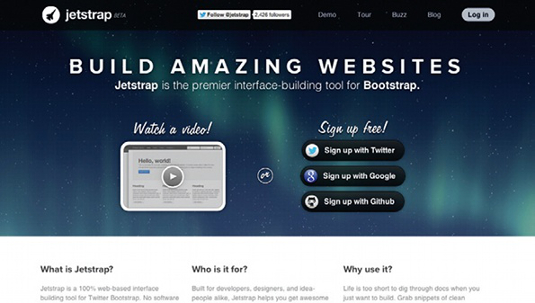
This tool helps developes to create the visual interface with innovation. This offers framework to the Bootstrap with the help of which designers can simply drag and drop the desired UI components. It effectively shows the final outcome of the website by providing a functional site.
Bootstrap
Bootstrap is a framework for website development. This tool takes help of 12-column responsive grid system. The features of this tool are vast that include style and JavaScript plug-in. Developers use Bootstrap to customize variables, components and JavaScript plug-in.
Gridless
Gridless is a standard for making responsive and cross-program websites with delightful typography. This apparatus concentrates on the dynamic improvement of a venture, and it serves as the beginning stages of an outline.
Gridset
Grid set is an instrument for making grid of any sort, for example asymmetrical, columnar, ratio, fixed, responsive, compound and more. This beta version device by Mark Boulton, whoever ends up being promising. Furthermore, did I specify, utilizing it is as straightforward as implanting a connection.
Tiny Fluid Grid
It is a magnificent web application that can help you focus the grid arrangement of your website interactively. Few elements that can be set like columns, minimum and maximum width and gutter percentage of your website design, including downloading CSS for the respective.
Flurid
It is a straightforward and exceptionally valuable cross-program CSS framework structure with up to 16 segments. Also, besides it doesn’t shroud pixels into edges.
Susy
Susy by Odd bird, is comparable in real life to the Semantic Grid System. It utilizes no additional markup or whatever other exceptional classes, however, are just aimed to the clients of Saas with its extension Compass.
Testing Responsive Websites and Friendliness
These are some tools that are useful for testing responsiveness of your website.
Responsive Design Test tool
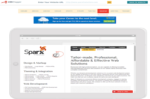
This is an effective tool from CSSChopper. It helps you to check the responsiveness of your website. The tool offers you the preview of a website on any of the screens you wish to operate your site upon. Responsive design testing tool saves a developer’s time that he would require to check the responsiveness of any website. Therefore, it is preferred worldwide.
Screenfly
Screenfly by QuirkTools, is an astonishing instrument that will give you the choice to enable or disable, scrolling or rotate the presentation, when you are viewing your responsive website in an assortment of gadgets: Desktop, Tablet, Mobile and TV.
Responsive.Is
This tool is created by TypeCast, amazing, responsive testing tool, by which responsive designs can be tested. It will change its size upon the device you pick as you enter a URL.
Browser Extensions For Responsive Design
You can pick some good extensions for doing responsive design and testing your responsive website.
Checkout this page : best google chrome extension to do responsive web design
Popular Responsive Web Design Tools
Style Tiles
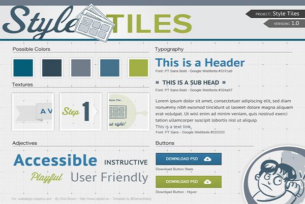
Style tiles are used to represent a gist of colors, typography, animations etc. It allows a designer to boast the website through a static mock-up. This helps designer to win over clients’ satisfaction as soon as a project begins. This also helps designers to avoid the future efforts for modifications.
Skeleton
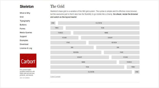
Skeleton development kit is created by Dave Gamache. This mobile tool is based on the 960.gs grid system and loads easily on mobile. Skeleton helps developers to build styles on top as it is considered a great style framework. Skeleton is good to choose for small projects. The tool also helps in styling standard HTML elements.
Golden Grid System
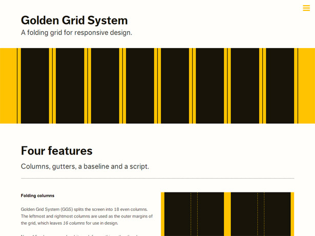
Developed by Joni Korpi, this tool helps developers to build custom responsive grid-based layouts. Any type or kind of grid is easy to create with the help of this tool. Golden Grid System helps designers to create asymmetrical, compound, responsive, fixed and fluid responsive grids from regular column grids. With this tool, tailored grids can easily be made that suits to the requirements of clients’.
Ink
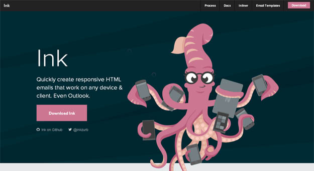
This tool helps developers to create responsive HTML emails that are easy to operate on any device. Ink is supported by CSS framework and helps designers to create HyperText Markup Language emails. The best thing about these emails is that it can be viewed on any device. With the use of this tool, website owners can reach to a number of online audiences. As responsive emails can easily be viewed on mobile phones, Ink helps developers as a framework to design the same.
Macaw
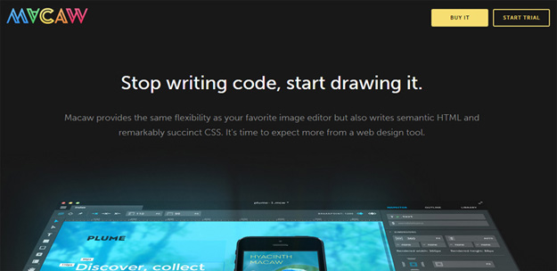
Macaw is an effective designing tool that helps to draw codes instead of writing them while a website is created. The tool can be used to write semantic HTML and CSS codes. With one-time fee you can easily download and install the application with a registered account. Macaw has great potential to be used as a design tool. The interface of this tool is impressive that helps designers to draw the codes. This tool helps to create fluid layouts and responsive breakpoints.
Responsive Tables
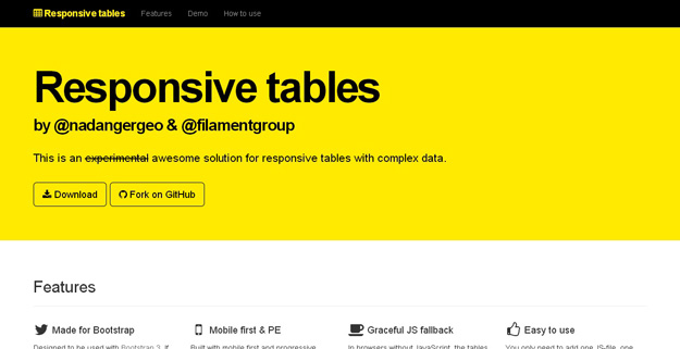
Data tables may create problems in responsive design. These tables can be wide and it must aim to cater large and complex data. Responsive tables may not look good when the viewpoint is adjusted. It may either appear too small to read or as a zoomed out text that require scrolling.
Responsive slides
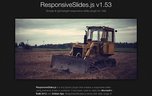
Responsive slides are light weighted plug-ins. This tool works effectively with a vast range of browsers that also includes IE 6. This plug-in uses CSS3 and permits captions and non-HTML elements inside a slide. The slides are set for time duration when there is multiple slide-show support.
Webflow-responsive web design tool
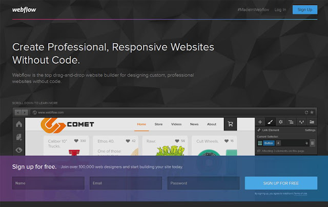
Webflow responsive web design tool offers a brilliant solution to the web developers for creating a custom website without coding. Developers can simply drag and drop the required elements and get a professional website.
Hotgloo
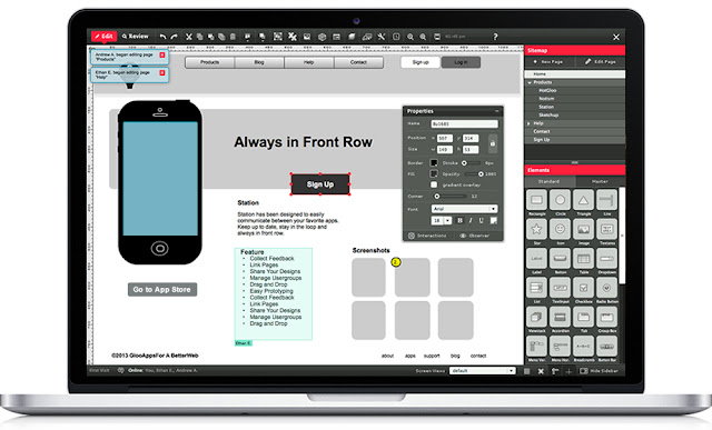
This is a mock-up and wire-framing tool. It helps designers to be in touch with their teammates and send the preview links to their clients. The tool has more than 50 UI elements and a well-built user interface master library. With the support of this tool changes and alteration can be done without even touching the codes.
Type Rendering Mix
This is a JavaScript library tiny is size. Type rendering mix can only be used when designers are using core text such as iOS and OS X. It helps in achieving consistent rendering and preserving the accuracy of sub-pixel antialiasing.
Pageres
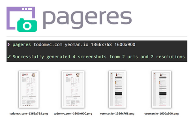
It is a command-line tool that helps to generate screen-shots in various resolutions for websites. The command-line option of this tool helps designers to specify different dimensions at a time and makes it easy to generate results for responsive sites at once.
Responsive Elements

Responsive elements are used to help different element to adapt and respond to the space they occupy. The tool is a small JavaScript library that is easy to use in any project. It helps to increase and decrease the amount of space taken by an element.
FROONT
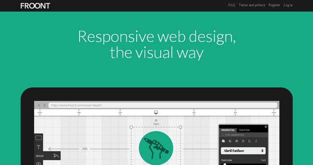
This web-based design tool runs in the browser and helps RWD become accessible to all kinds of visual designers. Design on the browser can be done with the help of drag-and-drop tool.
Wireframing And Mock-ups Tools
Creating wireframes and mockups for your web based project is absolutely essential for any web designer. This saves a lot of time in communicating with customer. Use of best mockup tools is going to make your life easier.
Responsive Wireframes
It is a free tool and available on the web for developing wirefames quickly for any project. It helps to insert elements, color and opacity, add text and resizing options. These effects can be re-positioned with feature like drag ‘n’ drops and can be saved for further reuse. It is primarily dedicated to responsive layouts, thus multiple view ports along with the quantity of each element used can be defined.
Wirefy
Wirefy is an astonishing wireframing application that stretches out assist web engineers and architects. It speeds up the job right from designing to last conveyances. It requests a basic work process so fresh UIs are effectively pulled together.
MockUPhone
MockUPhone, is a free web app, which eases creating mock-ups. It asks to identify a device among popular tablets and phones and screenshots are uploaded using drag ‘n’ drops. After uploading, the screenshots in multiple views and layout are developed automatically and are ready to be downloaded.
Want to try more wireframes and mockup tools we have a list of best mockup tools for web developers.
Best Javascripts And JQeury Plugins
These are some of the best Javascripts and JQeury Plugins that will help you develop highly responsive websites quickly.
Isotope
Isotope is a stunning jQuery plugin, which ends up being extremely valuable while planning a responsive configuration. It not only serves to rework the components of a webpage, the moment the browser window changes size or the screen size is small, but also filters those components.
Masonry
Masonry is a great jQuery plugin, which is utilized to make alterations and versatile formats. This plugin serves to adjust the components in your responsive configuration, so they can fit better in the open-spots on the network.
TinyNav.js
It is a little and a lightweight jQuery plugin, just 362 bytes, that changes over enormous route records into a little drop down menus for small screen.
Responsive CSS Tools
Here are some responsive CSS generating tools to speed up your CSS work in responsive website design.
Pure CSS
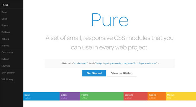
This is a responsive CSS module that is generally used by designers in almost all the projects. Pure is a tiny set of modules and is created exclusive to develope mobile friendly sites. With Pure, every line of CSS is carefully considered. In case a developer chooses small subset of these modules he is sure to save more bytes.
Responsive web CSS
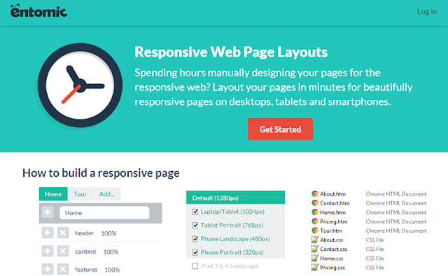
With this web-based tool, designers can create a responsive layout. The drag and drop option makes this task simple for designers. With this tool any number of pages can be added by defining the width in percentage.
Type Rendering Mix
It is a little JavaScript library that permits to apply styles just when Core Text is utilized (iOS and OS X) so as to accomplish a more steady rendering while protecting the precision of sub-pixel antialiasing.
Pure CSS
Pure is a Package of small but responsive CSS modules, ready to be used in web projects. The whole arrangement of modules times in at 5.7KB (zipped miniature version), without swearing off responsive styles, outline, or usability. Made because of cell phones, it was imperative to us to keep our record sizes little and each line of CSS was painstakingly considered. On the off chance that you choose to just utilize a subset of these modules, you’ll spare much more bytes.
Responsive Tables
RWD Table Patterns are a good solution for responsive tables with complex information. It’s a fork taking into account Filament Group’s report with a more finish arrangements and some new components. It’s constructed in view of mobile first and dynamic improvement. In programs without JavaScript, the tables will in any case be scrollable. There’s still some responsiveness. You just need to include one JS-document, one CSS-record and some insignificant setup to make the tables responsive.
Tools For Rendering Images, Videos And Fonts
Below are some useful tools for rendering images, videos and fonts.
Adaptive Images
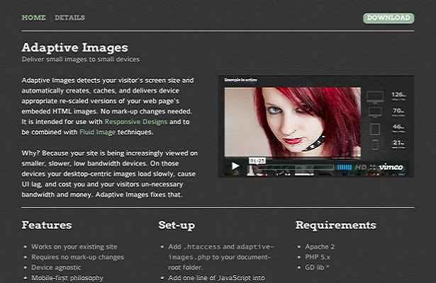
This tools recognizes the size of the device on which the mail is opened. Depending upon the size, the tool helps to deliver the embedded HTML view. Developers use this tool by combining and integrating fluid image techniques. Mark-up changes are not required and thus designers can easily use the tool. Adaptive images use one ht-access file, a single line of JavaScript and one PHP file to detect the device’s size. After analyzing the visitor’s screen size, the tool helps to create appropriate rescaled version of the embedded HTML image.
Adaptive Images
Adaptive Images distinguishes your guest’s screen size and consequently make, stores, and conveys gadget proper re-scaled forms of your page’s embeded HTML pictures. No imprint up changes required. It is expected for utilization with Responsive Designs and to be consolidated with Fluid Image techniques.
Pageres
Pageres is an order line apparatus for creating screenshots in distinctive resolutions for websites. Pageres is concentrate on sizes: you could script it to produce screenshots of responsive websites. The command line alternatives permit you to indicate numerous measurements immediately, so it’s anything but difficult to produce results for a responsive website.
FitVids.js
After pictures, now is the ideal time to make features responsive. Unless you truly feel comfortable around responsive coding, you may need to simply skirt to FitVids.js. It’s a jQuery plugin, simple in architecture and adjusts the measure of videos that are embedded to equate the screen size, while keeping up the right aspect ratio.
FitText
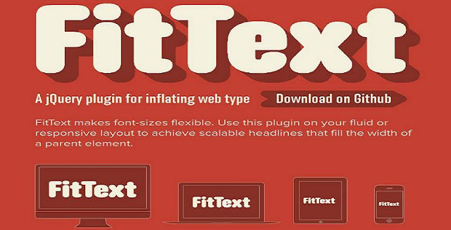
FitText is popular as a small JavaScript tool. It helps to adjust the size of the text and headline when the size of a window is resized. With this tool, there is no chance of mismatch of the text size. As FitText makes font size flexible, scalable headlines are easy to design.
The list of tools mentioned here are frequently used by web developers to provide an optimal viewing experience to user on different devices. With the support of these tools, designers can create awesome responsive websites.
As a passionate designer at Sparx IT Soultions, Tom Hardy spends most of the time in researching the latest updates to accomplish template designing in an efficient manner.
Other than traveling and shopping with her friends, Lucy Berrett loves open source and invented a fastest HTML to WordPress Conversion process at WPGeeks Ltd. Where she is working full time as Sr. Open Source Consultant and involved with many successful delivered projects.